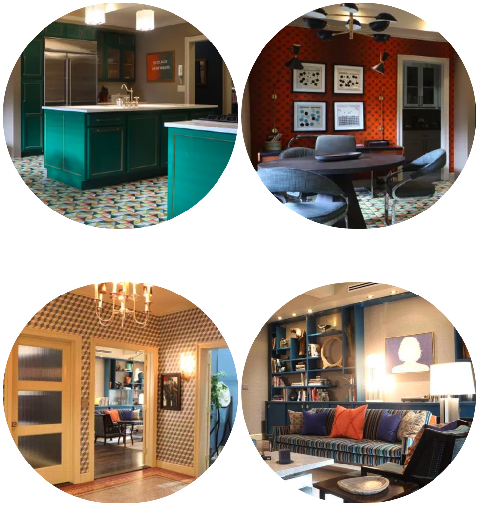
If you have found yourself drawn to any of the apartments in "Only Murders in the Building", it probably says something about your personality. Check out what the design styles of Charles-Haden Savage, Oliver Putnam, or Mabel Mora says about you!
Spring 2020 One Room Challenge – Week 3 – Let the Fun Begin!
Welcome to week 3 of the One Room Challenge! What a good week this has been, and I am glad I get to share the fun with all of you and all the other participants of ORC. If this is your first time here, and you would like to check out my previous posts from the challenge, click below:
Week 1 || Week 2 || Week 3 || Week 4 || Week 5 || Week 6
The One Room Challenge is a cool avenue to share and support fellow remodelers on their projects and designs. It also works as a neat way to spread creativity and inspiration to others, as well as a great motivation tool.
This week is one of my favorites! You might ask why? Well…because it’s when all my materials arrived. It’s like Christmas morning in the life of an interior designer! It’s so delightful to see all my ideas materializing in front of me. This is the week when the thoughts from my head start coming together, to create the “wonderland” that I puzzled in my mind for weeks.
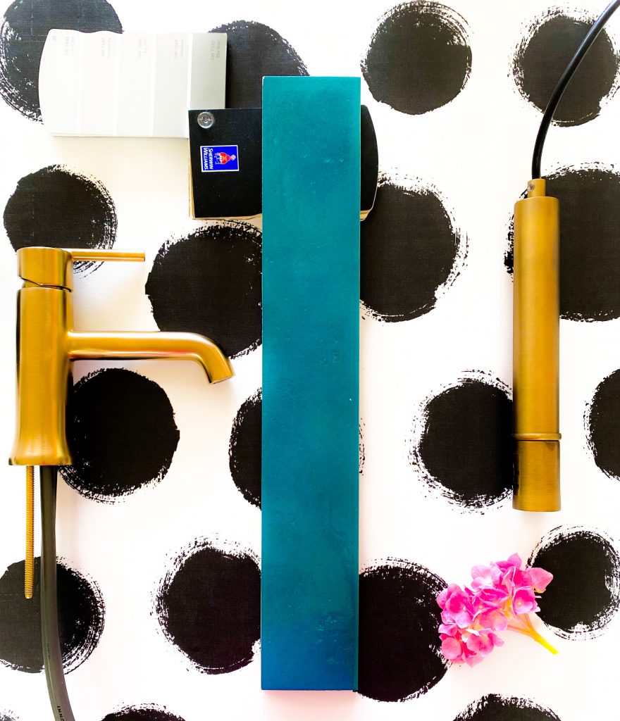
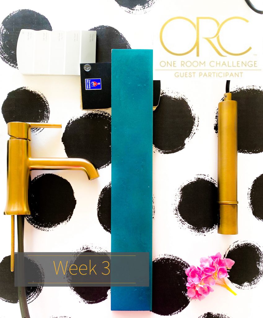
I am so pleased of how the materials mash together. The wallpaper is the BOMB! When creating any space, a focal point is necessary. Well, on top of being an amazing focal point, this wallpaper is also the POP that every room needs. It’s super bold and unapologetic, just what a small powder room needs.
When designing very small spaces, like a powder room, don’t be afraid to go bold. It is the perfect place to have fun and go wild. Otherwise it will be just another boring half bathroom that everybody has and that you have seen a million times.
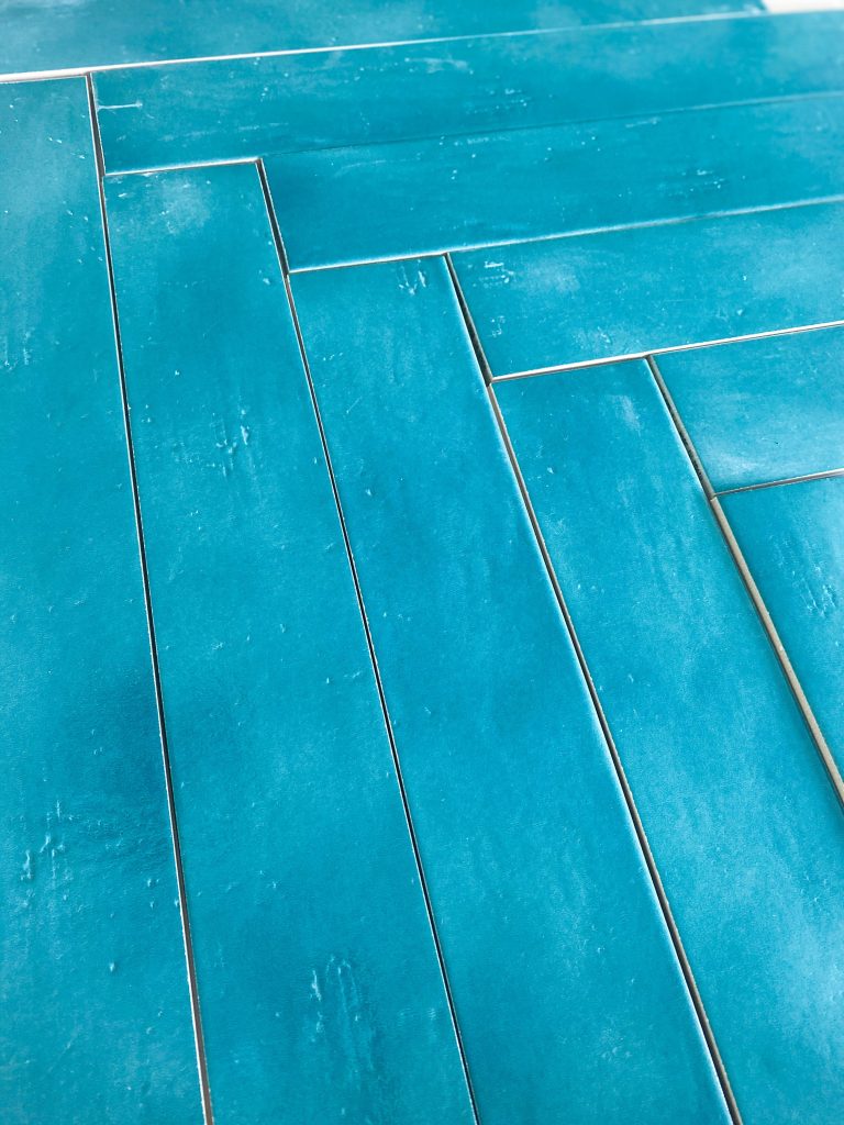
This takes me to my beautiful blue ceramic tile. I am very aware that the wallpaper is black and white, the vanity is light gray, and the walls are white. This makes a very monochromatic color scheme. Don’t get me wrong, I love a good monochromatic look, but the Brazilian in me is begging for some color! The rest of my house, so far, is very monochromatic, so I was itching for some fun color and life. To be completely honest, I designed the whole space around this turquoise blue tile. I found it while sourcing tile for a client and I just fell in love. All the other selections that I made was to complement the punch of color that the flooring will bring to the room.
And now let’s talk about jewelry. I mean…the faucet, pendant lights, and hardware, that are treated like they are jewelry by me. I selected antique bronze for their color. I LOOOVE gold, and I love the statement it makes in a room with such cool colors. It brings great warmth to a color palette that had none. Just like jewelry does to an outfit, the hardware, fixtures, and lighting, completes the look.
I’m beyond exited! Catch me next week to see if I can actually start installing anything, and LET THE FUN BEGIN!
Fernanda

Related Posts